Trend Alert! These Are Going To Be The Hottest Wall Colours In 2018

By Urban Company
3 min read
Dec 15, 2017
In 2016, whites and pastels were the hues of the moment. Then in 2017, we saw a shift to darker neutrals with wall colours in lilac and grey. So it is ...

If you’re thinking of renovating a room or just having your walls painted, pick the colour only after you’ve browsed the prettiest wall colour trends predicted for home decor in 2018.
<bold></format>
The Warm-Hearted: Caliente

Image Courtesy: The Farris Team
What It Looks Like –
It’s a daring red and unlike the reds we have seen so far, it doesn’t fall into the range of orange which means we’re avoiding the earthy-rusty effect.
Benjamin Moore, a renowned American Company producing paints, has named it colour of the year.
What We Love About It –
It really just sits nicely in a more intimate range rather than creating a shocking or abrasive effect on the living room layout.
Where To Use It –
Living Room & Entranceway
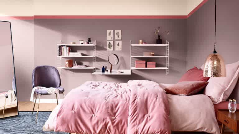
The Inviting: Heartwood

Image Courtesy: Dulux
What It Looks Like –
Heartwood is going to be the wall colour of the year 2018, according to
Dulux. It is a soft and warm tone of pink and gives the space a brighter look.
What We Love About It –
It draws a lot from the tangible qualities of natural wood and leather, conveying a sense of comfort and ease in response. Who would not want to nestle down on a homecoming treat like this!
Where To Use It –
Bedroom
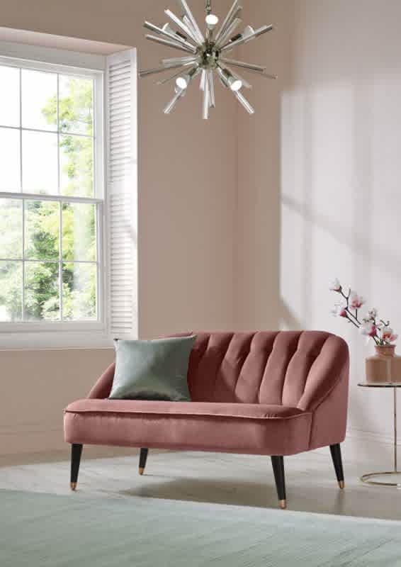
The Open Hearted: Penelope

Image Courtesy: Benjamin Moore
What It Looks Like –
A dusky pastel pink, being one tone deeper than millennial pink, has been announced as the colour of the year according to
Graham & Brown.
What We Love About It –
A versatile colour Penelope is as effective when paired with floral wallpapers and fabrics to give a soft and feminine look as it is when used alongside pastel wall colours and contemporary furniture to create a modern space.
Where To Use It –
Ideal for all spaces, especially a bedroom or living room
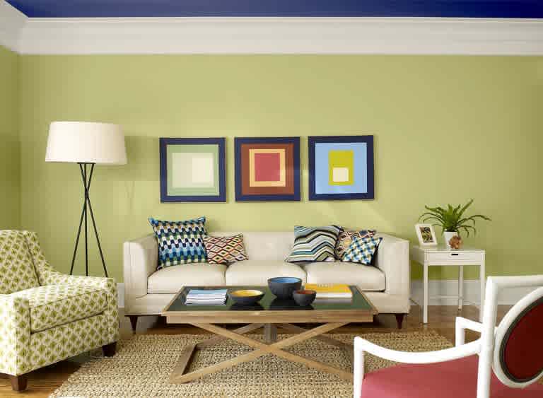
The Playful: Avocado

What It Looks Like –
A combination with yellow-toned green can also encourage a creative approach to life.Avocado, the playful colour, is going to play big in interior design in 2018.
What We Love About It –
There is a sense of energy with this colour and imagine plants hanging from walls! Avocado can create a space that is invigorating and full of life.
Where To Use It –
Living Room, Kitchen
The Cheerful: Autumn Maple

What It Looks Like –
A quintessential autumn colour, Autumn Maple introduces warmth into a home space. It is a gentle but hardwearing shade of orange that is vibrant and energetic.
What We Love About It –
This wall colour is for the ones who look for spacious homes. It lets you throw around natural fabrics in each room, with cotton throws draped over plush sofas. Now imagine this with tall windows that lets in as much light as possible to make the room layout look generous. The energy of this wall colour is activating, but not as overstimulating as the vibrant orange colour.
Where To Use It –
Living Room, Kitchen
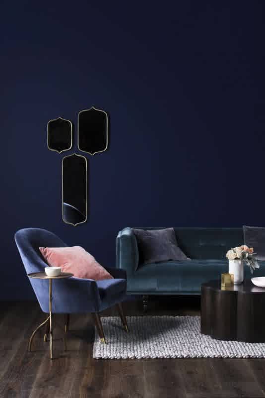
The Moody: Navy Peony

What It Looks Like –
Navy Peony is the darkest tone of blue and is going to be one of spring 2018’s hottest hues for homes, according to
Pantone!
What We Love About It –
You can use Navy Peony in your walls to add a dramatic touch. In your bedroom, you can mix this colour with metallic wall lamps and provide a modern design to the room.
Where To Use It –
Accent Walls, Living Room or Balcony
What’s your favourite colour for 2018?
section.<bold></format>


